In this blog post, we will pull out some of the design elements and animations and talk about them. We really enjoyed this project because it allowed us to add in many fun things; we added a lot of animations to give that extra special ingredient in our cauldron to make it a potent potion.
We've recently built and launched trick or treat, a fun little mini-experiment web project that uses pose detection to skeletonise your body in real-time. We've written in more detail what this here, or why not just head straight to the project here.
In all honesty, we had to refrain from spending loads of time adding lots of animations, but we had to draw the line somewhere.
Landing page 💜 🎃
One thing we would have loved to add but didn't have time was an animation of a hand or body coming out of the ground by the graveyard, but you never know; maybe we will be able to in the future.
We wanted the landing page to be tongue-in-cheek, colourful, vibrant, and playful. Trick or Treat was just a bit of fun, with some cool technologies used in the background. We could have shown off the technology by creating a demo that teaches you yoga or checks your running technique, and whilst they'd be helpful, we wanted to do something a little different.
Like the sensible people, we decided to use AI pose detection to turn people into skeletons. Of course, the landing page is still branded with splashes of Pixelhop's branding, but we "Halloween-ified" it by adding in the purple background, not forgetting to add in the odd ghosts and ghoulies here and there.
Logo 🕸🕷
One talking point is the Trick or Treat logo; as you can see, it animates in nicely, drawing the users attention as soon as the page is loaded. We paid particular attention to a "friendly evil" looking spider that drops down. We animated the logo by grouping individual layers in the SVG, allowing us to animate them independently.
To try and make the animations look realistic, we follow "The Illusion of Life", which are 12 principles that Walt Disneys Studios came up with within the 1930s.
In the video below, we've slowed down the animation. There were certain things you can spot here to make the fall look more realistic, one being how the spider bounces back up and then drops back down; following the laws of gravity, it drops but bounces back up a bit. It doesn't just drop and stop at the bottom.
This follows the "squash and stretch" principle that gives the illusion of weight to the spider.
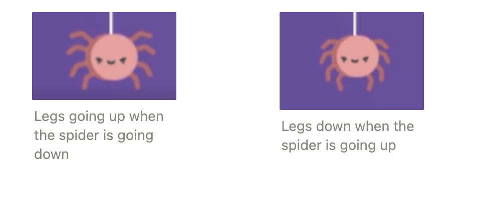
Another thing to note are the spiders legs- when the spider is dropping down, it's legs go up, and when the spider is going up it's legs go down.
This follows the "Follow through and overlapping" principle; when the spider drops to the bottom, its legs move after it, the whole spider doesn't stop at once.
Finally, the "exaggeration" principle can also be seen in the spider's movement and facial expression. When things are exaggerated in animation it makes it more fun and playful.
Eye 👁 👁
We wanted to add the eye at the bottom of the page to track the user's cursor. The mouse tracking eye is the sort of subtle detail we love adding to projects; it just adds a little bit extra to the page; it changes the page from static or stagnant to something alive and dynamic. So Talie built in the functionality and wrote a blog post on how he achieved that here.
Ghosts and ghoulies 👻 😈
Another way in which we gave the page a bit of life was by adding in the hovering ghosts and bats. In addition, we added in the blinking animation on the ghost to make them more characterful. Adding that subtle secondary animation allows for the animation there all the time without overwhelming or stressing the user out.
Curtains
We decided to add the curtains around the webcam because it's a nice way of framing the webcam thematically. It creates a "stage" for where the magic is about to happen, creates a bit of drama, and becomes more theatrical.
Animating the curtains was an iterative process, proving the power of The Illusion of Life, and how important the different principles are in conveying the correct "feel" across. For example, here, you can see that the animation was more bouncy, connotating a joyful, happy message rather than a more "Halloweeny" one.
We then had to think about how do we make it a little scarier; rather than bouncing up and down; it needed to be a bit more shakey from side to side and jalty. The keyframes needed to be closer together, so it rattles around more, and we added horizontal and vertical translation to make the movement more aggressive and the movements of the curtains sharper.
And eventually, we got to the version, which we were happy with.
Skeleton
Finally, I just wanted to talk about the skeleton briefly; after all, that is the main part of this little mini-experiment. We chose to use a skeleton for multiple reasons, one obvious one being it fits the Halloween theme very well. It's also perfect a perfect way to demo the technology, you can see how the head, arms and legs are mapped to the body in real-time. When you move, the skely moves too. It's exactly the way we wanted to showcase this tech. Playful and fun, like we are, here at Pixelhop.
Zef wrote a detailed blog and tutorial on how to transform your body and skeletonise yourself, which can be found here.
I could go on and on about all the other visual elements, its something we're really passionate about and love, as you can tell we're real sticklers for aesthetics and love to be a bit different and stand out - it's also how we approached the design of our own website.
We'd love to hear about your fav animations or design elements on the Trick and Treat site, you can contact us on our website here or on Twitter here.
If you would like to get notified about any future blogs or news, just sign up for our newsletter.