This is the second part of our tutorial series, where we create a real-time game using supabase and Vue. In this part, we will learn how to create a fancy cyberpunk-style animated logo using SVGs and anime.js.
If you haven't already, check out the first post in the series, so you know what we are making!
Here's a little vid of what we will be making. As you can see, we have a cool-looking logo for our game. It has a fancy build-in animation and then a secondary idle animation where the letters flicker to give it that dodgy neon sign effect.
Designing an "animatable" logo in Figma
Before we dive into the code, a few considerations need to be considered when designing a logo like this in Figma that make it much easier to animate once you have exported it.
Use paths where possible.
SVG paths give you more animation options than using a combination of rectangles.
When we originally designed the logo, we used a combination of rectangles to create the orange arrow and the blue lines above the logo. However, we realised this was a bad idea when we thought about how the logo should animate.
If we use paths rather than rectangles, we can use stroke-dashoffset to create a "line drawing" effect where the path is gradually "drawn" from one end to the other. Unfortunately, we can't do this with different SVG element types.
This means you will need to pick up the pen tool in Figma to recreate the shape as a single path using stroke to fill in the colour.
Using path makes it possible to animate a "draw-in" effect
Export text as individual layers in Figma
By default, when you write text in Figma and export it as an SVG, you will be presented with a single path element with all the letters combined. Of course, this is usually fine, but it means you are stuck if you want to animate the letters individually.
Unfortunately, Figma doesn't make this as easy as it should be. There's no native way to take a text layer and split it into multiple new layers for each letter. You could create a new layer manually for each letter, but then you have to space them manually, and no one wants to do that!
Luckily we found a Figma hack that makes this manageable.
Flatten the text layer.
Export only the text layer as an SVG.
Import the SVG you just created back into Figma and use it to replace the original text layer.
For some reason, the SVG you imported will have multiple layers grouped by letters! How handy!
Name layers sensibly and export with IDs
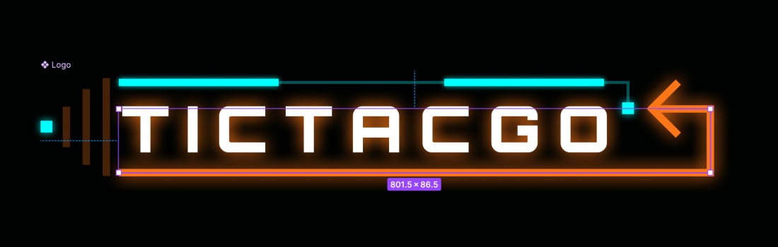
When you export your logo as an SVG, it will be a big file with many elements. To help us animate each layer, it's helpful to know what each SVG element is. To do this, you should give each layer in Figma a sensible name and select the "Include "id" attribute" option in the SVG export options.
Instead of randomly generated IDs, each layer will have an ID, including your layer name, making it much easier to know what you are looking at.
For example:
Turning your SVG logo into a Vue component
Okay, so now that we've talked enough about Figma, it's time to take our logo and bring it to life as a Vue component.
First things first, export the logo as an SVG from Figma. Once you have the .svg file, open it in VSCode to see its markup. We are now going to plop that markup into a new Vue component in src/components/Logo.vue; simply dump all the SVG markup into the template tag. Because we have ESLint and Prettier setup, it should be auto-formatted nicely when you save too! How handy! It should look something like this once you are done:
Now that we have our Logo component, let's temporarily add it to our page so we can see what we are dealing with.
Update src/pages/PageHome.vue to the following:
and you should see our wonderful logo appearing on the page, although huge and off-centre!
To fix the logo sizing, we can head back to logo.vue and delete the width and height attributes on the root SVG element. This will allow the SVG to adjust its size to its container.
Finally, in the designs, to really push home that dodgy neon sign story, the eagle-eyed amongst you may have noticed the logo is always a bit wonky. We can do this easily by adding a Tailwind rotate class:
Lovely! Our static logo looks good and is in a nice reusable component we can splash around all over the place. It's time to get animating!
Adding animation to the SVG logo with Anime.js
While you can get a long way with CSS animations, you will still need to reach for a library for more complex animations. Luckily we are spoilt for choice, and we have excellent options like GSAP, Motion One and our favourite Anime.js.
Why do we like Anime.js so much? Well, it is really powerful and can animate essentially anything you can think of, but it remains a tiny bundle size of 6.9kb minified compared to GSAP's 26.13kb.
You could achieve the same effect with most animation libraries, but we like keeping our projects lean, so the small bundle size is an excellent plus for us.
Anyway, let us get Anime.js installed:
and let us get it's types installed too
Now that we have anime.js installed let's prepare to use in Logo.vue
We need to import anime.js and the Vue onMounted hook to trigger animations when the logo is mounted.
Creating the build-in animation
When the logo first appears, we want it to "build in" where each part of it pleasingly reveals itself!
Let's start by creating a function called animateIn and then calling it in the onMounted hook.
You might be wondering why we are making a dedicated function and not just doing it all in the onMounted hook, but all will become clear in a bit.
Animating the letters
First, let's create an animation for each of the letters. If you followed the Figma advice earlier, you should see that each letter for "TICTACGO" has its own path. This will allow us to create a nice staggered animation where the animation for each letter is slightly delayed.
Add the following to the animateIn function:
Here we create a new anime.js animation targeting all letters in the letters group. We have set up animations for their scale and opacity to go from 0 to 1, and by setting the delay using a function, we incrementally delay the animation of each letter by 100ms.
You'll end up with something like this:
It's pretty cool but different from what we were going for! The letters fly in from the left-hand side rather than fading in and scaling in place. This is because, by default, transforms for SVGs are performed relative to the parent SVG rather than the individual element. Luckily we can adjust this using the CSS transform-box property. Here's a tweet we made explaining it a while ago:
Have you ever struggled to animate SVG elements using CSS transforms? 🤷♀️
The transform origin is relative to the parent SVG making it hard to transform.
With that in mind, add the following to the Logo.vue style block:
Now your animation should look like this! Better huh?
Animating the orange arrow
Now it's time to begin animating some of the other elements. Let's start with the orange arrow by adding the following to the animateIn function:
Here we create two new anime.js animations. The first targets the main orange line path and creates a "draw in" effect by animating its stroke-dashoffset property. Here we use the anime.setDashoffset helper to return the exact length of the path so we can go from having a completely blank path to a completely filled in path. If you want to learn more about this technique, check out this great CSS Tricks Article: https://css-tricks.com/svg-line-animation-works/
The second animation targets the arrow tips of the orange arrow. These are separate from the main path element, so they needed to be animated in after the path was fully drawn.
We use the delay property to make sure they appear at the right time. When creating animations like this, you will spend much of your time tweaking timing values to make things look just right!
Here's the result:
Animating the top blue lines
It will be cool if the blue lines above the main logo text draw in next, following on from the orange arrow.
The blue line consists of multiple parts that need to be animated one after the other. Anime.js provides a timeline function that can make this sort of animation easier by chaining different animations onto each other.
Add the following to your animateIn function:
Here we create a new timeline with some default properties duration: 300 and easing: 'linear'. These will be inherited by each of the following animations created using the add function.
Next, we create the first animation in the chain:
This fades in the first blue square after a delay of 600ms. We can then create the next animation, which will be triggered as soon as the first is finished to draw in the thinner part of the blue line:
Notice the stroke-dashoffset trick again to draw the line in. Also, notice how we overwrite the default duration and easing of the timeline.
Finally, we have the two thicker blue lines that sit on top to animate in too.
You should recognise most of this by now, but you may have spotted the second parameter passed into the add function. This offset allows you to adjust when this part of the timeline starts playing. For example, for the first thick line, we pass a value of -=500. This says, rather than starting exactly when the previous animation finishes, start 500ms before it's finished. Again, this provides a way of tuning your timeline to make it look perfect.
To be honest, we find that when you start using offsets with timelines, it can get pretty hard to wrap your head around, and often you are better off just creating several individual animations and adjusting the delay manually yourself. It was worth demonstrating the timeline functionality though!
Your logo should be looking pretty funky now!
Animating the tip of the logo
So far, we have a logo that builds in, starting with the letters and following around the edge. The last part missing animation are the three lines and dot to the left of "TICTACGO".
Let's sort that out! Update your animateIn function again with this:
Here we create four new animations to create a staggered "flash" effect, starting with the rightmost rectangle and ending with the little left square. We achieve this by animating the fill-opacity property from 0.27, to 1, and back to 0.27 again. Here, instead of using the timeline, create the stagger effect by manually setting the delay of each animation.
Your build-in animation will now be complete!
Creating an idle animation
We want the logo to look like an old flickering neon sign, so after the build-in animation happens, we should make a few of the letters flicker.
Create a new function in the Logo.vue called flicker and with the following:
Here we target two letters and create a flicker effect by animating the opacity of the letters very quickly. Then, we add loads of keyframes into the opacity array to ensure it doesn't look like a fade and is more of a flicker.
Now let's update the last animation in our animateIn function to start our flicker animation when it's finished.
When the #logo-end-dot animation is complete, it will start our flicker animation. Let's see it:
Making the animations optional with props
Yay, our fantastic animated logo component is almost there! There is just one more step we need to take before we are finished.
It would be useful to toggle the build animation on and off because we are unlikely to want the logo to animate in like that every time it's used. Let's add a prop that will allow us to turn it on and off:
Here we create a new prop called animateIn and default it to false. Currently, this won't do anything. We need to add a bit more logic to the onMounted hook to make use of this new prop:
Perfect! If the animateIn prop is not true, the logo will be static and start the flicker animation immediately!
And we're done!
We initially thought this part of the blog series would be pretty brief, but as you can see, quite a lot of work goes into making a little animated logo like the one we just created.
Hopefully, you learned a few tips on how to make SVG's easier to work with when exporting from Figma, Anime.js and Vue.
Now we have an awesome logo, we are ready to start putting together some of the screens for our game. Watch out for the next part of this series, where we will create the home screen and its components!
Remember to subscribe or follow us, so you don't miss out on the next part of the tutorial!