In the final part of this 3 part series, I will be looking at Aaron Draplin. This is probably the designer I have been following the longest and who has shaped how I design.
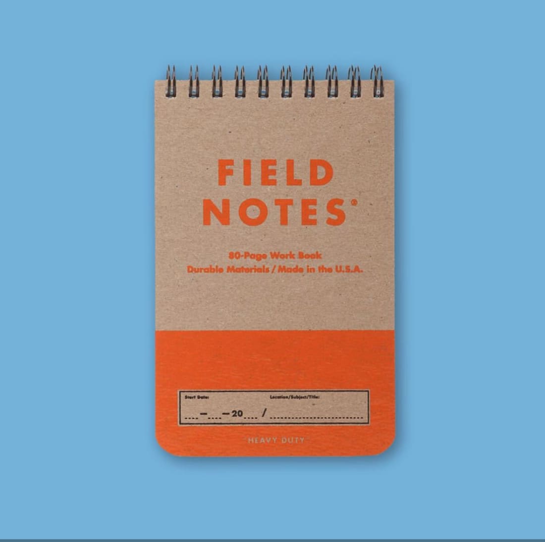
I was first introduced to Draplin when I was in college. He’s sort of the OG Graphic designer for my generation. He’s the co-founder and designer for Field Notes that I am sure most of you would recognise:
Field Notes
In 2001 he won ‘Art director of the year’ award and his clients include Nike, Burton Snowboards, Esquire, Red Wing, Ford Motor Company and the Obama Administration.
He has done talks for TED and Google but also works with Skill share to help the rest of the design world. He’s known for clean, simple and truly original designs
What do I like about them?
Well, first of all, he’s just a really likeable guy! There’s nothing overly arrogant or snobby about him despite his success.
Secondly, he finds inspiration from anywhere, which is something I feel I can relate to. If you watch any of his Youtube videos you’ll see that he just digs around and finds logos/designs anywhere and takes them as inspiration.
And thirdly because he keeps things really simple! He doesn’t ‘over design’. He says it well himself, designs that work 40 years ago and still work today are the best designs. Which I know is hard in the digital world as we are constantly evolving but when it comes to stripped-back graphic design this is your man! I love that he considers the background and history of a brand project before he’s even thought about what it’s going to look like. The video above is all around great, you really see how he works, in a sketchbook, believe it or not, sketching and doodling and being generally creative! I’ve always walked around with a notebook in hand, as much as I love my computer and Adobe and Figma, there’s nothing like quickly jotting or drawing something down that comes to mind. Honestly, I watched this video when it first came out and all of it still resonates and helps me design. I love that he shows us who has inspired and helped him throughout his career as well. His method of working still feels refreshing and he never over complicates anything. Which is represented in his work:
What do I like about their work?
‘You can’t mess with a bedrock of how a logo works all over the world.’ Is something he says himself and why do I love this? because his point is that it’s never just a logo or a design, think where it’s going to be used, and who is going to see it. Will people understand it? We can use the same line of thinking for app designs. If it isn’t user-friendly or people don’t understand it then what is the point? It should be clear and simple and it should work in all different formats which all of Draplin's work does.
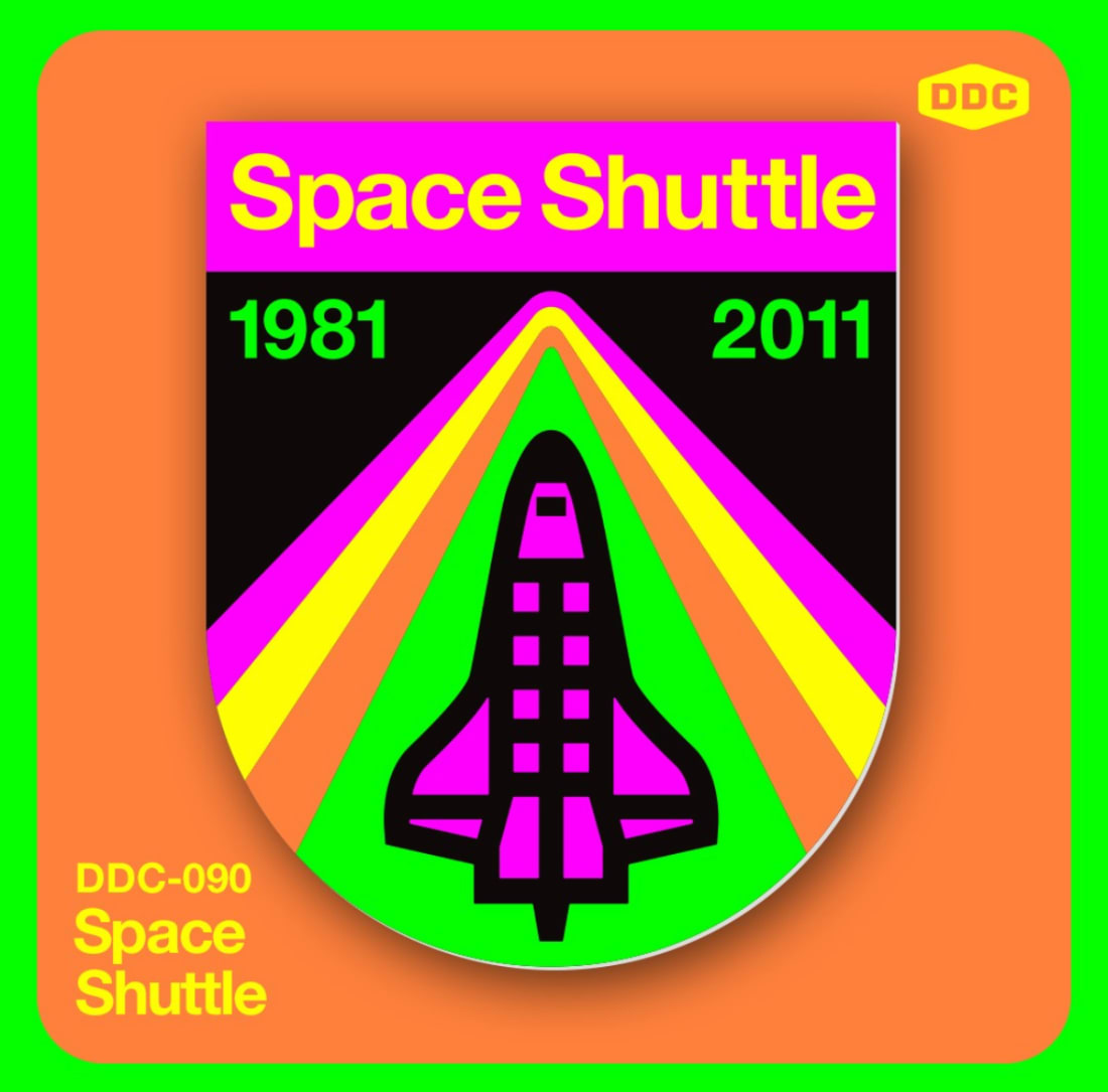
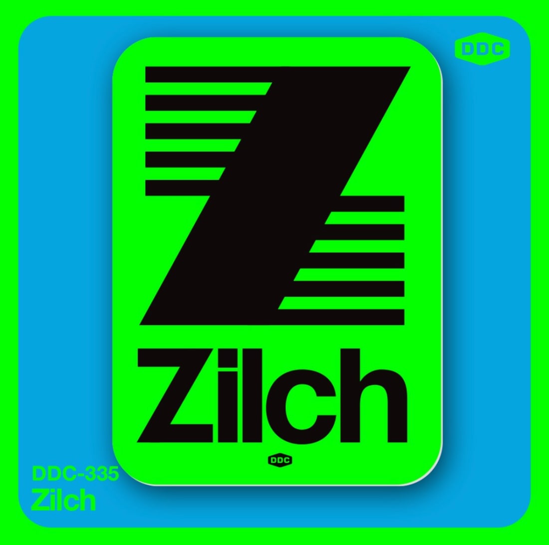
His own logo design is simple but memorable and instantly recognisable. I love how he creates bold designs. I find most of his work quite industrial in terms of colour but recently he has produced some pretty eye-catching vibrant pieces:
Draplin Design Co LogoDraplin DesignDraplin DesignDraplin Design
My Interpretation
As per the other posts, I am creating my own interpretation of a Draplin logo. I used the same approach that he does in the video above. I only spent an hour creating this logo but his method is one I have and always will use.
What is the logo for? As this was just for fun I figured I would create a logo for my new side hustle. It’s become apparent that I am really good at fitting objects in spaces that others struggle to. For instance, when I moved into my new home I watched 4 of my mates attempt to get a chest of drawers up the stairs, I waited until they gave up and then manoeuvred it up the stairs pretty easily myself, much to their disgust/admiration. The other day my pal was trying to squeeze a microwave into a small space in her kitchen, after hours of attempts she gave up and was about to put the microwave up on Marketplace, calling it a defeat. Until I walked in and within 30 seconds it was in place. Now look, I am not saying I have a gift but…maybe I do, and is this gift wasted? Quite possibly. It’s now been decided amongst my group that I should become a removal specialist, and I am not going to argue with that. We decided it should be called ‘She Can’ - brilliant huh.
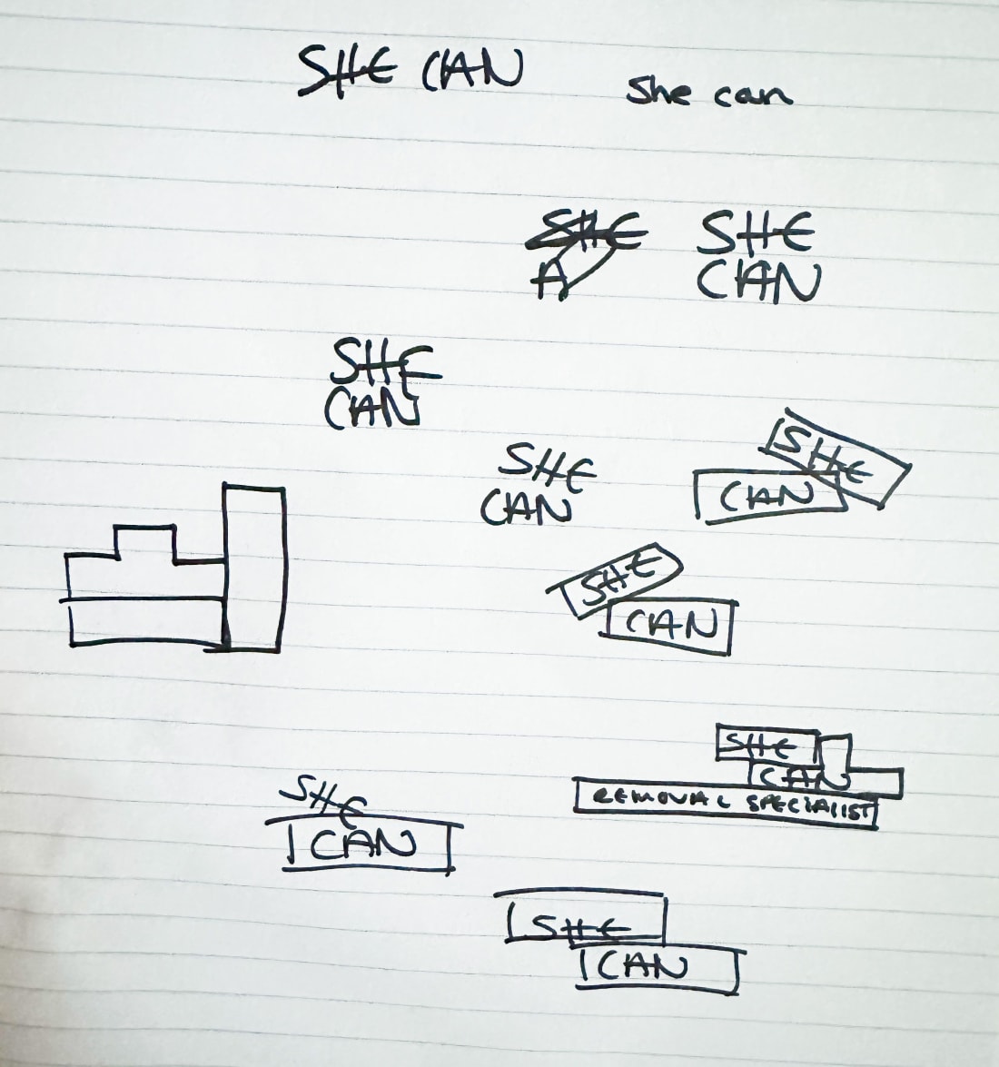
So I started as Draplin does, sketching out some ideas, lower case/ upper case etc. I started to think of tetris and fitting objects into spaces:
My quick sketches
I then took those designs and started to play around in Illustrator creating the font and moving parts around and generally just having a play. I started with the idea of a tetrus like look or the words in boxes like a stacking effect. So I created a really boxy looking font using shapes:
It’s looking OK but it’s not ‘it’. So I decided I wanted the font to be thicker and bolder - I think removals I think bulky!
As I hadn’t flattened my shapes yet, when I enlarged everything I was left with this kind of disjointed font which I quite liked as it worked with the ‘slotting in’ idea but it wasn’t again quite hitting the sweet spot. So I played around with straightening the font but keeping it bold and moving the position of the words around slightly.
I was preferring the bulkiness but I wasn’t liking the disjointedness of it all. Actually, my aim as a specialist should be to get everything to fit nicely! And so I took my new bulky font and I popped it in a box (like a removals person might do) and I made sure all the spacing was all the same size around the logo as well as in between. I used the same width of the font for the outer space and then half of that between the letters horizontally and vertically.
I was liking this, I just need to add my tag line…
I like it, maybe we can make it pop a little more though with some colour. Although a good logo traditionally should always work well in just black and white, we can afford to have a little fun.
And there we have it, for an hours work, not too bad! I am sure if I played around for a couple days I could get something pretty epic, but the point is to show the working method. And I like it! It would work small like on instagram or large - like on the side of a removals van.
So get doodling!! And lemme know if you need something squished in somewhere.
In our first blog post of this 4 part series we covered one of the original ‘isms’ with Skeuomorphism, and now we’re moving into more modern trends with a look at Interactive design. What is Interactive Design and how can it work for you?
What is Skeuomorphism and how it's developed?
This blog post is the first in a 4 part blog series in which I will cover design trends from the 80's Skeuomorphism to today's re-emerging Y2K designs. It's always interesting to see how and why some trends stay or don't. And perhaps why some trends drip on through all eras. We'll also look at some truly inspirational work which will hopefully inspire.
What is Claymorphism and how can you create the look?
In this 4 part series, we have previously covered Skeuomorphism and Interactive design, and now we're going to look at another modern trend, another 'ism' Claymorphism. If you've not read this series's two previous blog posts, why not check them out? If not, here's a brief run-through of these trends and how we got here.